
Looking at a bunch of numbers and trying to make sense of them can be really confusing and overwhelming. That’s why people who work with data a lot often use graphs to help summarize and present the information in a clear, visual way.
Graphs are super important tools for anyone who needs to understand and share insights from data. People like statisticians, scientists, economists, teachers, and even political analysts use graphs all the time in their work and to help explain their ideas to others.
But here’s the good news: you don’t need to be an expert to understand a graph. In fact, graphs are designed to make it easy for anyone to quickly grasp the main points and trends in a set of data.
In this review, we’ll show you how to analyze different types of graphs and use them to come up with meaningful interpretations and conclusions. By the end, you’ll be a pro at reading and understanding graphs!
Table of Contents
What are Graphs and Why are They Useful?
Graphs are like pictures that help us understand numbers and information more easily. They make it simpler to see patterns and trends in data without having to look at a bunch of confusing numbers.
Imagine a big high school with 850 students in different grades. If the school wants to know how many students are in each grade, they could look at every student’s enrollment form, but that would take a long time.
Instead, they can use a graph to show the information in a way that’s quick and easy to understand. They might make a bar graph, which uses tall or short bars to represent the number of students in each grade.
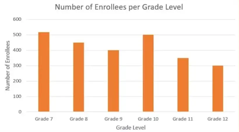
By looking at the bar graph, the school can quickly see which grade has the most or least students, without having to count each enrollment form. Graphs make it much faster and easier to understand important information and make decisions based on the data.
Various Graph Types Used in Statistical Analysis
1. Bar Graphs
Bar graphs are used to show the quantity or amount of different categories. They can be either vertical or horizontal.

Vertical Bar Graphs:
- The horizontal axis shows the categories
- The vertical axis shows the quantity or amount for each category
Horizontal Bar Graphs:
- The horizontal axis shows the quantity or amount for each category
- The vertical axis shows the categories
Bar graphs are best for comparing quantities across different categories. For example, you can easily see which month had the highest or lowest sales.
Multiple Bar Graphs
Multiple bar graphs show more than one piece of information for each category. They include a legend to explain what each bar represents.
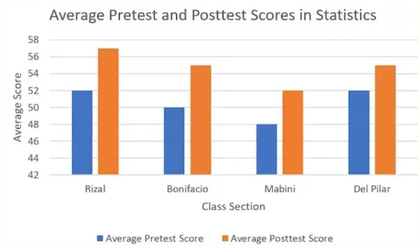
For example, a multiple bar graph could show the average pretest and posttest scores for different classes. Each class would have two bars: one for the pretest score and one for the posttest score.
Example Problem
A bar graph shows the number of people from different professions at a science conference:

- Physicists: 120
- Chemists: 90
- Biologists: 80
- Geologists: 60
To find the difference between the number of physicists and geologists, subtract:
120 physicists – 60 geologists = 60 more physicists than geologists
So bar graphs make it easy to visually compare quantities and amounts across categories. The bars clearly show which categories have higher or lower values.
2. Line Graph
A line graph is a type of graph that uses straight lines to show how data changes over time. It has two axes: the horizontal axis (usually representing time) and the vertical axis (representing the quantity being measured).

When to Use a Line Graph?
Line graphs are best used to show trends or patterns in data over a period of time. They help us understand how values change from one point to another.
Multiple Line Graphs
Multiple line graphs have more than one line plotted on the same graph. They are used to compare how different variables change over time. Each line represents a different variable and is identified by a legend.

Example Problem
Given a multiple-line graph showing the annual net profit of three companies from 2017 to 2020, answer these questions:
- Which company had the highest net profit in 2017?
- Estimate the difference in annual net profit between Companies A and C in 2018.
Solution
- Company C had the highest net profit in 2017, as its line is plotted higher than the others for that year.
- Based on the graph, we can estimate that in 2018, Company A’s net profit was around ₱590,000, and Company C’s was about ₱500,000. The estimated difference is 590,000 – 500,000 = ₱90,000.
3. Pie Chart
A pie chart is a circular graph that is divided into slices. The entire chart represents a complete set of data, while each slice represents a portion of that data. The size of each slice corresponds to its numerical value.
Here’s an example of a pie chart that displays the annual budget of a small city.

It shows how the budget is distributed among different expenses such as construction, health, education, research and development, and environmental preservation. The chart also indicates the percentage of each expense relative to the total budget. For example, 38.46% of the total budget is allocated for construction.
When is a Pie Chart Used?
A pie chart is used to illustrate the “part-to-whole” relationship in a given set of data. It helps us understand the composition of the entire data by dividing it into different categories. In the example of the annual budget of a small city, we use a pie chart to show the distribution of the budget across different areas like construction, health, education, etc.
How to Interpret a Pie Chart?
Let’s consider the annual budget of Lemongate City, which is presented as a pie chart.
Suppose the total budget is ₱130,000,000. We want to determine the allocated budget for construction based on the given pie chart.
According to the pie chart, 38.46% is allocated for construction. To find out the amount allocated for this category, we multiply the total budget (₱130,000,000) by the percentage allocation for construction (38%):
₱130,000,000 x 0.3846 = ₱49,998,000
Therefore, out of the ₱130,000,000 annual budget of Lemongate City, ₱49,998,000 is allocated for construction.
Sample Problem: Favorite Movie Genres
Now, let’s consider a different example. Below is a pie chart representing the favorite movie genres of 200 students from Lemongate City High School. We will answer the following questions based on the chart:

- How many students have romance as their favorite movie genre?
- How many students have science fiction as their favorite movie genre?
- How many students have a favorite movie genre that is not action?
Solution:
According to the pie chart, 10% of the 200 students have romance as their favorite movie genre. Therefore, 0.10 x 200 = 20 students have romance as their favorite genre.
According to the pie chart, 25% of the 200 students have science fiction as their favorite movie genre. Therefore, 0.25 x 200 = 50 students have science fiction as their favorite genre.
According to the pie chart, 25% of the 200 students have action as their favorite movie genre. This means that the remaining 75% of students do not have action as their favorite genre. Therefore, 0.75 x 200 = 150 students have a favorite movie genre that is not action.
4. Pictograph
A pictograph is a type of graph that uses pictures or symbols to represent data. The word “picto” means picture, so a pictograph is literally a “picture graph”.
For example, let’s say a clothing store wants to show how many T-shirts they sold each day of the week. They could use a pictograph like this:
Monday: 🎽🎽🎽🎽🎽
Tuesday: 🎽🎽🎽
Wednesday: 🎽🎽🎽🎽
Thursday: 🎽🎽
Friday: 🎽🎽🎽🎽🎽
In this pictograph, each T-shirt symbol 🎽 represents a certain number of shirts sold, like 10 shirts. A key or legend explains what each symbol means.
Why Use Pictographs?
Pictographs are used to make data more visually appealing and easier to understand quickly. The pictures help tell the story of the data in a simple way.
Pictographs work best for fairly simple data. More complex data is better shown with other types of graphs.
How to Make a Pictograph?
To create a pictograph:
- Collect the data you want to show
- Choose a simple picture or symbol to represent the data
- Decide how many data points each symbol will represent
- Draw the pictograph, using the right number of symbols for each data point
- Include a key that explains what each symbol represents
- Give the pictograph a title and label the data
That’s the basic idea of pictographs – using pictures to create a simple visual representation of data!